There has been rampant internet speculation lately that the death statistics being reported for COVID-19 are being inflated. The skepticism is fueled in part by the large numbers of deaths being assumed to be due to COVID without a laboratory test to confirm. And also by numerous anecdotal stories of people who died from other causes while infected with the virus being included in the count. See here and here for examples. The topic is so prevalent, our wonderful Washington press corps even tried to goad President Trump into giving them a damning soundbite at Friday’s press conference. (He didn’t bite.)
There are lies, damned lies, and statistics.
Mark Twain, stolen from Anonymous
This seems like an easy enough thing to check on. While “died from / died with” and “confirmed / assumed” might have some grey area to them, “dead / not dead” is pretty cut and dried. It makes sense (to me at least) that if non-COVID deaths are being incorrectly counted as COVID deaths on a large scale, than the number of total deaths should be increasing less than would otherwise be expected. One way to check this would be to look at the total number of deaths so far in 2020, subtract off the number of deaths you would expect if there was no COVID, and compare that number to the official COVID death count. If the official COVID count is significantly higher, that would indicate there might be some padding going on. If the official count is much lower, we may be actually under counting COVID deaths. If the numbers are close, the official statistics are probably pretty accurate. So what is an engineer with way too much State-mandated free time on his hands to do? Why, crunch some data of course!
Torture the data long enough, and it will confess to anything.
Ronald Coase
So, there are a couple of problems with my plan. The first problem is determining the number of total deaths that would have occurred without coronavirus. I decided to compare the 2020 total death values to the previous 5 years, and also to the average of those 5 years to get a rough estimate of the “normal” amount of total deaths. The second problem is actually getting the data to analyze. Given the intense interest and need for information, finding near real-time statistics for coronavirus deaths is pretty easy. Finding up-to-date statics on total deaths is much harder. The best source I could come up with is the CDC. They compile data from death certificates and post it here. The problem with this data set is there is a significant lag. CDC depends on the states to submit the death certificates, which typically takes anywhere from 1-8 weeks according to their disclaimer. Previous weeks are continuously updated as more death certificates come in. Upon examining the data, it quickly became obvious that I would not be able to analyze the whole county. The numbers for many of the States are just too incomplete. So I decided to focus on a handful of states which are coronavirus hotspots and also have usable data. I choose to limit the comparison to the first 17 weeks of the year. The end of that time period is recent enough to be well into the outbreak and also far enough in the past that the data are reasonably complete. Let’s start with my home state of Michigan:


The first thing that jumps out in the graph is the obvious 2020 spike starting around week 13, which corresponds to late March. The total number of deaths for the first 17 weeks are shown in the table for each year, along with the delta vs. 2020. For 2020, the 17th week ended on Saturday, April 25th. For comparison, the official number of coronavirus deaths in Michigan thru April 25th is 3,274 [source]. The official count is less than the delta for 4 out of the 5 previous years. The only exception is 2018, which was a particularly bad flu year. There is nothing in the Michigan data to suggest the coronavirus death toll is exaggerated.
New York has been the epicenter of the pandemic in the US. Unfortunately, the data for the State of New York is obviously incomplete. However, CDC does have data for NYC which appears usable. NYC is the only city the CDC breaks out separately.


The huge spike in the 2020 curve is a visual confirmation of the absolute horror NYC has been. The official number of coronavirus deaths in NYC thru April 25th is 17,154 [source]. That number includes 12,958 confirmed COVID deaths, and 4,196 probable deaths. The official count is less than the delta for all 5 of the previous years. Again, there is nothing in the data to suggest the death toll in NYC is being exaggerated. In fact, it looks like the numbers might even be a little low.


New Jersey has obviously been hit very hard by the coronavirus. The official number of coronavirus deaths in New Jersey thru April 25th is 5,863 [source]. New Jersey lists their death count as lab confirmed COVID deaths. This official count is considerably less than the delta for all 5 of the previous years. This suggests the coronavirus death toll in New Jersey could be significantly underestimated.


The official number of coronavirus deaths in Massachusetts thru April 25th is 3,255 [source]. This official count is in line with the delta for the previous 5 years. The coronavirus death toll for Massachusetts does not appear to be exaggerated.


The official number of coronavirus deaths in Maryland thru April 25th is 959 [source]. This total includes 890 confirmed COVID deaths and 69 probable. This official count is less than the delta for all 5 of the previous years.
Conclusion
So, are COVID-19 deaths in the US being exaggerated? Sadly, there is nothing in the available data to suggest that is the case. Admittedly, this data set is incomplete and far from perfect. It will be interesting to see what the numbers look like in a few months when the numbers are finalized and the whole country can be included.
Postscript
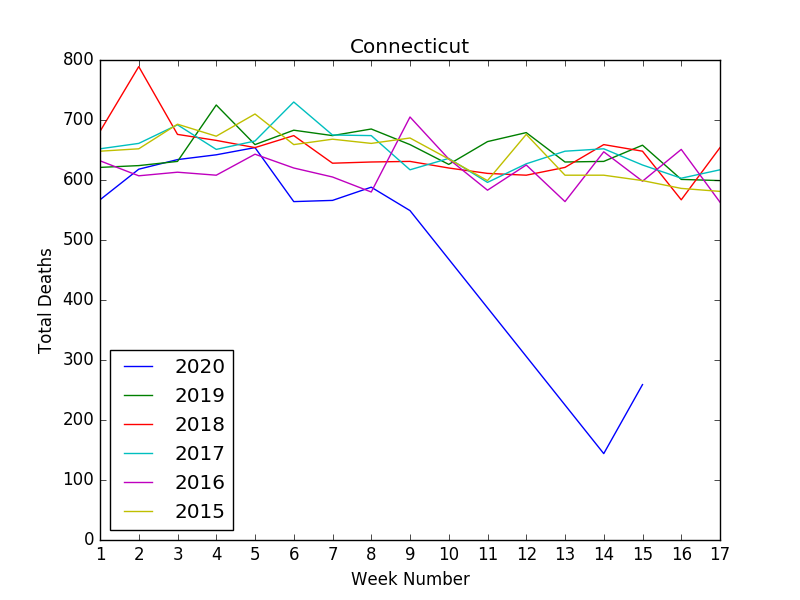
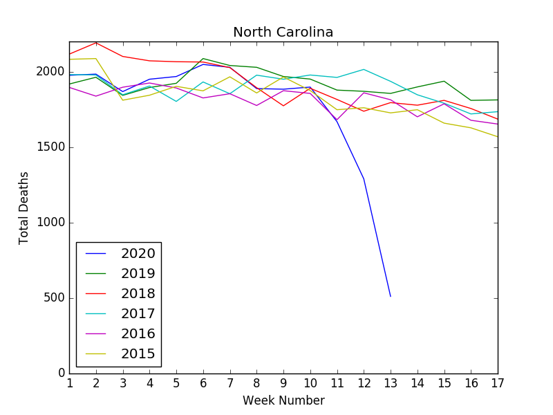
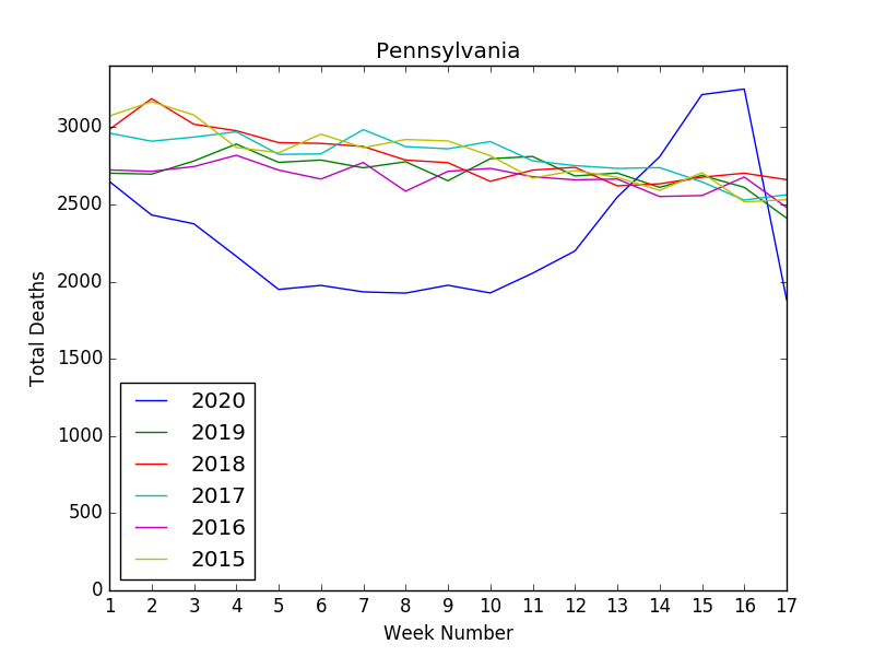
One other thing that really jumped out while plotting the CDC data is how completely different the pandemic has affected the various States. The chart for NYC looks like something out of an apocalyptic horror movie. Looking at the charts for the States below, you would never even know there was anything unusual about 2020. This isn’t exactly news, but seeing it visually really drives the point home.


